Sample report · illustrative example, not a real product · this is what you get
50out of 100
Your app
Verdict: Rough
Good idea, unfinished execution
https://yourapp.example
AI generator fingerprint detected: AI builder template defaults
Untouched component styling, generic icon cards, and default spacing make the page read like a first AI-builder draft rather than a finished product.
All six dimensions, in full
Clarity and Promise
58
What works
The page names a product category early, and the main button is easy to find.
Slop tells
The headline promises to save time without saying who the product is for or what it actually does. The sections below it each describe a different benefit, so the main promise gets blurry.
Top fixes, ranked by impact
1. Try rewriting the headline as one sentence that names the user, the task, and the outcome.
Rewrite my homepage headline so it names who the product is for, what it helps them do, and the result they get. Keep it under 12 words and avoid vague phrases such as work smarter, all in one, or unlock your potential.
2. Consider adding one plain sentence under the headline that explains how it works.
Add a one-sentence subhead under my homepage headline that explains, in plain language, what a new user does first and what they get back. Keep it under 24 words.
3. Try making every section support the same promise.
Review each section heading on my homepage and rewrite it so it supports the main promise in the headline. Remove or move any section that talks about a different benefit.
Craft and Design Integrity
41
What works
The text is readable and the main buttons use one consistent accent color.
Slop tells
The page mixes three corner radius styles, uses a default outline icon set, and the spacing changes from section to section. The gradient hero and three-card feature grid look like an untouched AI-builder template.
Top fixes, ranked by impact
1. Try picking one radius and spacing system and applying it everywhere.
Standardize my site to one corner radius, one spacing scale in 8px steps, and consistent card padding. Update every card, input, and button to match.
2. Consider replacing the generic feature icons with real screenshots of your product.
Remove the generic icons from my feature section. Replace each one with a cropped screenshot of the real product doing that feature, with a short factual caption.
3. Try removing the template-style gradient from the opening section.
Restyle my opening section with a solid background, one accent color, and a real screenshot of the product. Remove all gradient blobs and decorative glows.
Trust and Legitimacy
52
What works
The price is visible and the product name is consistent across the page.
Slop tells
There's no contact route, no privacy policy or terms, no company name, and nothing about how user data is handled. The one testimonial has only a first name and a stock avatar.
Top fixes, ranked by impact
1. Try adding a complete footer with real contact and policy links.
Add a footer to my site with the current year, my legal business name, a working support email, and links to Privacy and Terms pages. Don't add any link that doesn't resolve.
2. Consider explaining what happens to a user's data before they sign up.
Add a short note beside my signup form saying what information is stored, whether it's shared, and how a user can delete it. Link the note to the privacy policy.
3. Try removing the testimonial you can't attribute until you have a real one.
Remove the testimonial that has only a first name and a stock avatar. Leave the space empty rather than replacing it with made-up proof.
Flow and Usability
64
What works
The main signup button is easy to find, and the form only asks for an email.
Slop tells
The pricing buttons open the same signup form without confirming the plan, the demo link goes to a blank page, and submitting the form gives no sign that anything happened.
Top fixes, ranked by impact
1. Try giving the signup form clear loading, success, and error states.
Update my signup form so that submitting disables the button and shows a loading message, a failure shows a specific inline error, and a success takes the user to the next step.
2. Consider carrying the chosen plan into checkout and confirming it before payment.
Connect each pricing button on my site to checkout with the selected plan. Show the plan name and price in the checkout summary before the user pays.
3. Try fixing or removing the empty demo link.
Check my Watch demo link. If a real demo exists, open it in an accessible modal with a close button. If it doesn't, remove the link.
Mobile and Access
47
What works
Body text stays readable on a phone and the signup field fits the screen.
Slop tells
The main action falls below the first phone screen, the pricing table scrolls sideways, and several footer links are smaller than 44 pixels to tap.
Top fixes, ranked by impact
1. Try moving the main action into the first phone screen.
On mobile, tighten my hero spacing and place the main signup button directly under the subhead so it's visible at 390 by 844 pixels without scrolling.
2. Consider stacking pricing plans instead of keeping the desktop table.
Replace my mobile pricing table with stacked plan sections. Keep every feature label visible and remove sideways scrolling.
3. Try making every tap target a usable phone size.
Set every mobile button and text link on my site to at least 44px tall with at least 8px between neighboring targets, especially in the footer and pricing area.
Conversion and The Ask
39
What works
The page has one main call to action and shows a price before the final section.
Slop tells
The first two signup asks come before any price, the Get started button doesn't say whether payment happens now, and there's nothing about trial or cancellation terms.
Top fixes, ranked by impact
1. Try showing the price and commitment beside the first signup ask.
Add my exact trial length, price, and cancellation terms directly beneath the first signup button, matching checkout exactly. Don't hide any condition in a tooltip.
2. Consider making the button label say what happens next.
Change my main button from Get started to a label that says exactly what happens next, such as Start my free trial. Use the same label on every button that opens that flow.
3. Try adding one short, true line that lowers the risk before the final ask.
Add one short line above my final signup button that says when the user is charged and how to cancel. Only include claims my product actually supports.
Competitor A names its audience and outcome in its first sentence, while your page makes visitors piece the promise together from several sections.
What they do well
Its headline speaks to one audience with one realistic outcome, and every section below repeats that same promise.
Where they are ahead of you
It commits to one audience and one outcome. Your page tries to serve several needs at once, so the headline stays broad.
What to take from them
Pick one audience and name them in the headline.
Cut or move any section that doesn't support the main promise.
Repeat the core outcome in the final call to action.
From Build the Damn Thing: This is the Ugly Baby Test in action: talk to 10 potential customers about their biggest problem and let their words decide which audience you lead with.
Competitor B shows the product working right away, while your page leads with broad benefits before showing what the product does.
What they do well
It puts a three-step walkthrough with a real screenshot for each step directly under the headline, so visitors see what using it looks like before they're asked to sign up.
Where they are ahead of you
It shows instead of tells. Your first screen is benefit statements, and a visitor has to scroll past several sections to see the product.
What to take from them
Add a real product screenshot to the first screen.
Replace the benefit cards with three short steps showing how it works.
From Build the Damn Thing: Build the Damn Thing's product-market fit chapter makes the same point: show people a working minimum product and prove they want it, rather than describing it.
Competitor C states its price and trial terms next to its signup button, while your page asks for an email before saying what it costs.
What they do well
It shows the price, the trial length, and whether a card is needed, all beside the main button. Its footer has a contact email and current legal pages.
Where they are ahead of you
It answers the money question before it makes the ask. Your signup button has no price nearby and your footer has no contact details, which makes a first-time visitor hesitate.
What to take from them
Show the price, or say it's free, right next to the signup button.
Add a real contact email and working legal links to the footer.
Say exactly what happens after someone signs up.
Keep going · Included free
The BUILD prompt guide: 35 Prompts to Build the Damn Thing
A $50 guide, included free with your report. 35 useful prompts for the marketing, sales, and leadership moments of running a business. Fill in the {bracket}, paste it into ChatGPT or Claude, and go.
A note from Kathryn
Let's get started
These prompts help guide you through the conversations you need to have when you've just got started building your business. You know what you need to say and could use a little help saying it.
Here's how to use them:
1
Find your set
Pick the set for what you're working on: marketing, partners, sales, pitching, or hiring.
2
Fill in the {bracket}
Pick the prompt that fits and swap in your specifics.
3
Paste and go
Drop it into ChatGPT or Claude, then edit what comes back until it sounds like you.
The prompt gives you a draft. The voice is all yours. And when you hit a wall these prompts can't fix, when you need the idea, the name, the logo, or the product itself, that's what BUILD is for. It takes you from the idea in your head to a real product you can sell, with tools that do the heavy lifting and a community of Builders who get what you're carrying.
You're already building something. That puts you ahead of everyone still just talking about it.
Kathryn Finney, founder of BUILD and author of Build the Damn Thing
Prompts 1 to 7Marketing and content
Reach for these when you have to show up and market without a team or a spare hour.
1.
Write 5 Instagram caption hooks for a {business type} owner who has 10 minutes a day for marketing.
2.
Turn this rough idea into a 30-second reel script: {rough idea or update}.
3.
Write 3 versions of an Instagram bio for a {business type} that sounds confident, not corporate.
4.
Give me 7 days of simple content prompts for a {business type} with zero content team.
5.
Rewrite this caption so it sounds like a real person, not a brand: {paste caption}.
6.
Write a "day in the life" post script for someone running a {business type} solo.
7.
Give me 5 ways to repurpose this one piece of content into a week of posts: {paste content}.
Prompts 8 to 14Partners and co-founders
Reach for these when the hard part isn't the work. It's getting two owners on the same page.
8.
Write a message to a business partner proposing we revisit roles now that we're scaling {business type}.
9.
Draft a fair way to split responsibilities for {task or department} between two co-founders.
10.
Write talking points for a difficult conversation with my co-founder about {specific tension}.
11.
Turn this list of disagreements into a one-page alignment doc we can both sign off on: {paste list}.
12.
Write an agenda for a monthly co-founder check-in meeting for {business type}.
13.
Draft a partnership update email to send to our advisors and investors about {business type} progress.
14.
Write 3 questions to ask a potential business partner before we commit to working together.
Prompts 15 to 21Sales, offers, and pricing
Reach for these when you are the product and every message has to earn its keep.
15.
Write a sales caption for {product or service} that leads with the transformation, not the features.
16.
Draft a DM script to follow up with someone who asked about {product or service} but didn't buy.
17.
Write 3 ways to explain the price of {product or service} without sounding defensive.
18.
Turn this testimonial into a short-form ad script: {paste testimonial}.
19.
Write an email announcing a limited-time offer on {product or service} to my list.
20.
Draft a script for handling the objection "{objection, e.g. it's too expensive}" from a potential customer.
21.
Write a post that turns a common customer question into a sales opportunity: {paste question}.
Prompts 22 to 28Pitching inside a company
Reach for these when you're doing founder-level work inside someone else's company and need it to land.
22.
Write a one-paragraph pitch for {project or initiative} I can send to my leadership team.
23.
Turn this list of accomplishments into 3 bullet points for a performance review: {paste list}.
24.
Write a LinkedIn post announcing {project or milestone} in a way that highlights my role.
25.
Draft an email requesting budget or resources for {project} with a clear ROI argument.
26.
Write a script for pitching {idea} in a 5-minute meeting slot.
27.
Turn this feedback into 3 action items I can present as a plan: {paste feedback}.
28.
Write a message asking my manager for {specific ask, e.g. more ownership, a title change}.
Prompts 29 to 35Hiring, delegating, and your personal brand
Reach for these when the business runs and the job becomes leading it, and being known for it.
29.
Write a job post for hiring a {role} for my {business type}.
30.
Draft a delegation email handing off {task} to a team member with clear expectations.
31.
Write a personal brand bio for speaking and media opportunities as the founder of {business type}.
32.
Turn this win into a press-worthy pitch angle: {paste win or milestone}.
33.
Write a script for a podcast guest appearance introducing {business type} in 60 seconds.
34.
Draft an out-of-office "I'm stepping back" message that still sounds in control of {business type}.
35.
Write a year-in-review post celebrating {business type}'s growth without sounding like a humblebrag.
Ready to build the actual business?
These prompts sell what you have. BUILD is where you build it.
BUILD gives Builders the tools that do the heavy lifting and a community of people going from idea to income.
These prompts are for informational purposes only and are not legal, financial, or professional advice. You are responsible for reviewing anything you create with them before you use it, and for anything with legal weight, have outside legal counsel review it first. BUILD is not responsible for the results of using these prompts or for any changes to your business that follow from them.
The books behind the prompts
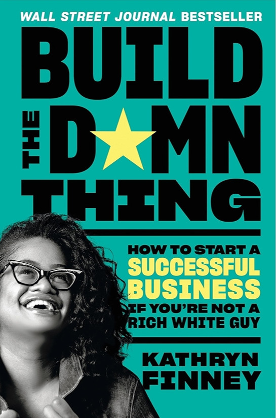
Build the Damn Thing
How to Start a Successful Business if You're Not a Rich White Guy
The Wall Street Journal bestseller and the playbook behind every tool inside BUILD: a direct path from idea to business, written for the Builders the standard startup playbook was never built for. Every prompt in this guide stands on its frameworks.
The old definitions of entrepreneurship are too small for the way people are actually working now. Pre-orders open soon, and the waitlist hears everything first.